Bethesda games have allways been at their best when allowing the player to freely explore vast worlds, littered with big and small points of interest, whilst looking to move the adventure ahead to wherever one wants it to lead. Rarely did things go as planned, but digging up new storylines, fascinating places and interesting characters on the way being the reward, commonly outweighed the inconvenience of ending up at the exact opposite of what you planned for. It is baffeling then that the team, that pretty much wrote the book on sandbox design with landmarks like Fallout 4 and Skyrim, decided to go full crowbar in following their vision of a large scale open-universe sci-fi saga, in blissful ignorance of what disservice the combination of their dream of a gigantic space sandbox and the limitations of its’ tech would do to the formula.
The core experience ended up being a fast-travel simulator in a world-mosaic of a thousend pieces, throwing the player into countless, disappointingly small, glorified fishboals.
Starfield‘s struggles with identity become apparent as soon as the underlying creation engine is tasked with handling transitions between locations. Its known difficulties at providing a truely coherent world and seemless traversal, paired with its remarkable ability to make everything feel way more complicated than it should be, produces an underwhelmingly restricted and shockingly outdated interpretation of its makers’ grand vision.
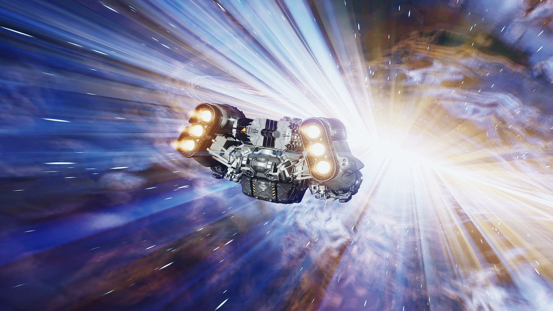
Pitched as a science fiction saga of incredible scale and endless adventure, the core experience ended up being a fast-travel simulator in a world-mosaic of a thousend pieces, throwing the player into countless, disappointingly small, glorified fishboals with little more to explore than recurring prodcedually generated structures, blobs of minerals and settlements. Seperated from each other by a flood of fade-to-blacks and pre-rendered loading animations, replacing the excitement of space travel with little more than short form advertisements for a journey through the stars, that looked great in the catalogue, but turned out being a sadly ironic reminder of what could have been.
The excitement of space travel is replaced by adverts for a journey through the stars, that looked great in the catalogue, but turned out being an ironic reminder of what could have been.
Fallout 4 and Skyrim offered large scale open worlds that – despite there being a lot of loading screens as well – did a remarkably good job at pretending to be one coherent place to care for. Starfield however makes the mistake of fragmenting its universe into often tiny, mostly forgettable, gated playgrounds, that are not connected with each other in an immersive way. Each location feels strangely disconnected from the rest of the world. Completely counter-acting the planned for sensation of scale and significance and sabotaging the player’s curiosity drive. It does not help that what narrative morsels the game has to offer, is rarely more than an off the shelf task clutter, embedded in make-shift storytelling and interstellar commute, that could have been an e-mail.
Nintendo‘s The Legend of Zelda: Breath of the Wild has shown that easy to-do jobs like these do have a place in open worlds. As long as they are built smartly around robust enough systems, that allow them to act merely as directional markers, giving the player a basic reason to move into a certain direction. It is then not about the task its self, but the journey and making the world and its’ features the player’s favorite toy to experiment with. But when neither narrative, nore world building and traversal offer enough depth to make the voyage worthwhile, there is too little left to keep your gameplay loop running.
It’s a case of scale over substance and the story of a game that became an inadvertent advocate for the need for strong producing.
This is where Starfield over-estimates its’ appeal. Backing the wrong horse in making the broad narrative, bland exploration and mere scale of the experience its’ star, without it being able to carry the weight. A toxic mixture of technological restraints and unfavorable design choices standing in contrast to the creator’s intreguing vision, dictating a structure of disconnected and undercooked locations – too small and unremarkable to make the exploration game kick.
It’s a case of scale over substance and the story of a game that became an inadvertent advocate for the need for strong producing, finding harmony between vision and practicability and that in game design, more often than not, less is more and that size matters. However, differently than you might think.


